
In this blog, we will see which fonts are ideal and which one needs to be skipped. Also, you will learn how to keep the balance of size, style, and spacing. You’ll also see quick visual examples, charts, and tips that make your CV design not just readable but memorable.
What Is The Best Font For CV Writing?
Let’s be honest, the font on your resume is what makes or breaks the first impression. This is why choosing the best font for CV is important. Here are some of the most loved fonts people use for their CVs:
| Font | Look | Why It’s Good | Best For |
| Calibri | Modern and clean | Super easy to read | Office jobs |
| Helvetica | Simple and smart | Looks fresh and balanced | Marketing or design roles |
| Cambria | Classic | Great for printed CVs | Teaching or research jobs |
| Arial | Clear and friendly | Safe and professional | All kinds of roles |
| Garamond | Elegant | Gives a classy touch | Creative jobs |
| Roboto | Neat and digital | Looks great on screens | Tech and IT jobs |
Don’t use fancy or curly fonts. They might look fun, but they make your CV hard to read. Stick to fonts that look clean and easy on the eyes.
Cool Resume Fonts That Stand Out
You might wonder if my CV looks stylish and serious at the same time. Yes, it totally can! You just have to choose cool resume fonts that look modern but are still easy to read. Some fonts have a little “spark” without going overboard. They grab attention in a subtle, classy way. Here is how different font styles give different vibes:
Font Style vs. Impression
| Font Style | Impression It Gives | Example Fonts |
| Modern | Fresh and confident | Calibri, Roboto, Lato |
| Classic | Polished and trustworthy | Garamond, Cambria, Georgia |
| Minimalist | Simple and clear | Helvetica, Open Sans, Arial |
| Creative | Unique and playful | Raleway, Poppins, Montserrat |
If you’re applying for creative or design roles, fonts like Raleway or Montserrat work great. But if it’s a more formal field like finance or law, go for Cambria or Georgia. They look mature and dependable.
Keep in mind your job requirements. Write your job application according to the needs and demands of the company. For example, if they prefer resumes written in first person, then you must search “Resume first person” and see what patterns and structure are followed in writing that.
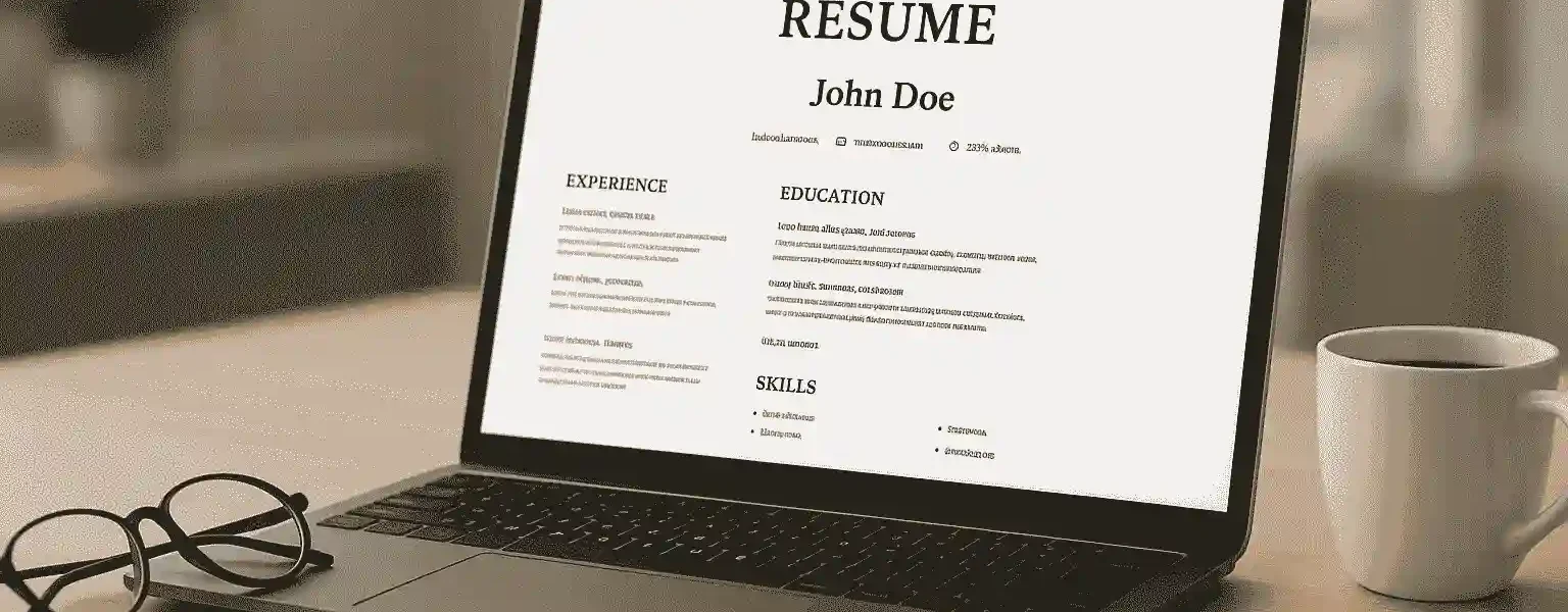
The Right Font and Size for CV
Okay, so you’ve found a nice font. This is great. But here’s the next thing, which is that the size and spacing you use matter just as much. Here is a simple guideline that you can follow:
| CV Part | Ideal Font Size | Why It Works |
| Your Name | 16–18 pt | Big enough to stand out at the top |
| Headings (like Experience, Education) | 12–14 pt | Bold and easy to spot |
| Main Text | 10–11 pt | Simple and smooth to read |
| Contact Info | 9–10 pt | Smaller, but still clear |
How Fonts Affect the First Impression of Your CV
First impressions happen fast, like just a few seconds. Before a recruiter even reads a single line, their eyes scan your CV’s layout. And guess what stands out the most? The font.
A good font makes your CV look tidy, calm, and professional. A bad one makes it look rushed or careless, even if your content is amazing. Fonts actually shape emotions. They send a message about you before your words do. Here’s a quick look at how different fonts are usually seen:
Font Style vs. First Impression
| Font | Professional Feel | Friendly Feel |
| Calibri | 5 stars | 4 stars |
| Helvetica | 5 stars | 3 stars |
| Cambria | 4 stars | 3 stars |
| Garamond | 4 stars | 5 stars |
| Roboto | 4 stars | 4 stars |
See how some fonts feel sharper and more formal, while others look warm and friendly?
That’s the magic of typography. It quietly changes how your CV feels.
If you’re applying for a creative job, go with something softer like Garamond or Roboto. For formal roles, Helvetica or Cambria is perfect. Match your font’s mood with your job type. You can also ask a professional CV maker to help you understand the right fonts.
Common Font Mistakes People Make in CVs
Let’s face it. Most CVs don’t get ignored because of a bad experience. They get ignored because they look confusing. Fonts play a big role in that. Here are some common font mistakes people make and how you can easily avoid them. Also, if you don’t want to make these mistakes, then you must get in touch with a professional CV writing service provider.
| Mistake | Why It’s a Problem | How to Fix It |
| Using too many fonts | Makes your CV look messy | Stick to one font for the whole CV |
| Tiny text | Recruiters can’t read it easily | Keep your body text around 10–11 pt |
| Huge headings | Feels unbalanced | Use 14–16 pt max for headings |
| All caps | Looks like you’re shouting | Use capital letters only for section titles |
When in doubt, open your CV and ask yourself, “Would I enjoy reading this?” If the answer is yes, your font choice is probably right.
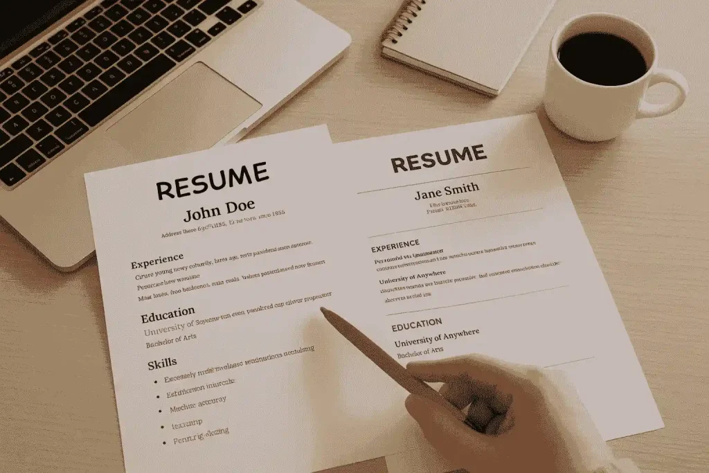
Why Font Consistency Matters for Your CV’s Look
You can have the world’s best font, but if you fail in consistency, then your resume will look off. Mixing style, size, and fonts makes your resume look unplanned and messy. Here is a quick before-and-after idea to show how things have changed when they feel consistent:
Consistent vs. Inconsistent CV Fonts
| Example | Description | Result |
| Before | Uses 3–4 different fonts, random sizes, bold everywhere | Looks cluttered and confusing |
| After | Uses 1 main font with clear headings and spacing | Looks clean, professional, and easy to read |
Pick one main CV font for the whole CV. If you really want some variety, use the same font but change the weight, like regular for text and bold for headings. That’s enough to make it look neat and structured. Fonts aren’t just design choices; they show your attitude toward detail. And that’s something every employer values.
Frequently Asked Questions
- What font should I use for a resume?
The best fonts that you can use are Helvetica, Cambria, and Calibri. They look modern, clean, and easy to read.
2. What size font should I use on my CV?
Keep the font of your main text up to 10-11 points. Headings should be in bigger points, like 12-13 points.
3. Can I use more than one font on my CV?
Yes, but no more than two. One font for headings and one for text is more than enough.
Final Thoughts
Your font may not seem like a big deal. However, it is one of the first details that recruiters notice. The right font can make your entire CV look well-organized, confident, and easy to read, which means a better chance of getting noticed.
Keep it consistent, simple, and aligned with your profession. If you ever feel unsure about your font layout, don’t hesitate to reach out to a professional CV writer. They will be able to clearly guide you on balancing design and detail in your CV to maximize your opportunities.